
«But the navigation in MY daily apps is located on the opposite side of the screen» –
‘That one Product Owner.’
It is not a bad statement by itself, however it is important to question where the claim is coming from why is it something to care about all of a sudden.
After some research talking to multiple Product Owners, we realized that the following comments were surfacing while talking about the applications:
- User’s can’t find the menu.
- I’m sure the rule is for the menu to be on the left side, it is in all of the apps I use every day.
- Once we move the menu, I’m sure the complains will stop.
- The logout is usually on sight.
- The user profile is easily accessible at the top right of most applications.
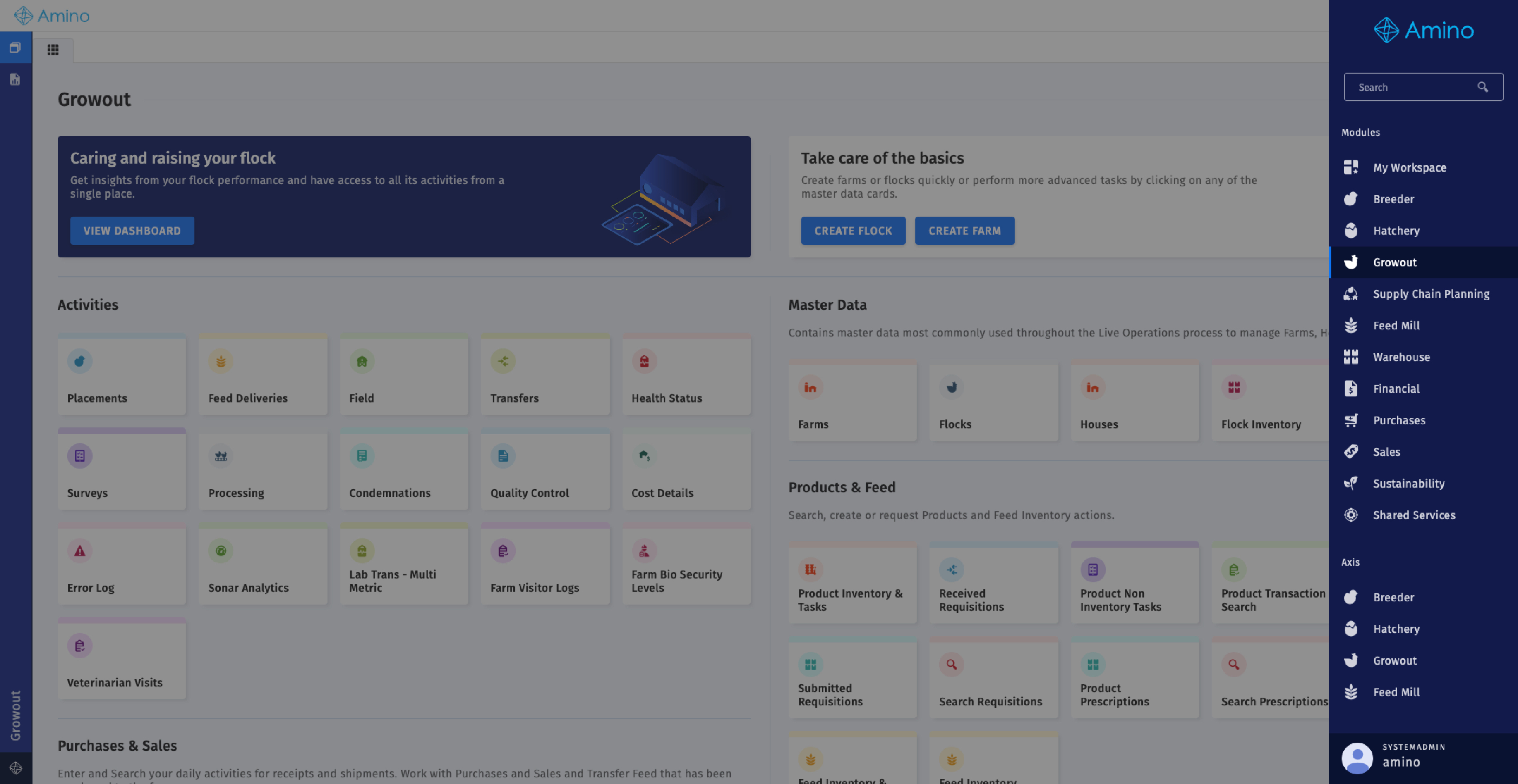
So, what can we get from this?
- There are people complaining, but we do not have any direct phrase that states that the menu should be somewhere else.
- People that have direct contact with the customers, have been giving a thought on how to solve the problem.
- We can check on the problem, to be fair we haven’t checked on the use of the menu in a while, so to review this now that it has attention won’t hurt.
Assessment
- These claims are based on the applications that Product Owners use in their day-to-day work. It is essential to consider that users may not use the same applications or may not be accustomed to the exact location for these options.
- For navigation within the application, it is worth noting that we already have a side navigation on the left side. This navigation enables users to move between the sections of the modules (Reports, Report Writer, Workspace). This means it should either be moved or reconsidered if we plan to relocate the module navigation to the left side.
- Regarding use, in this application, users frequently move between modules and into Settings, but not to their user profile. It will require space from the header toolbar to add all of our basic actions at the header, especially if users are not actively looking for them.
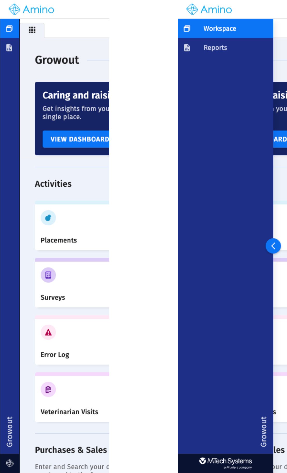
As you may notice I am considering not only the comments, but the use and the actual layout of the screen. We should as well consider, that users that have no trouble with it, it might tumble them for a while if we move the navigation. And this only to relocate a simple hamburger button, but it is in a daily use application.
First Option – Changes Proposed
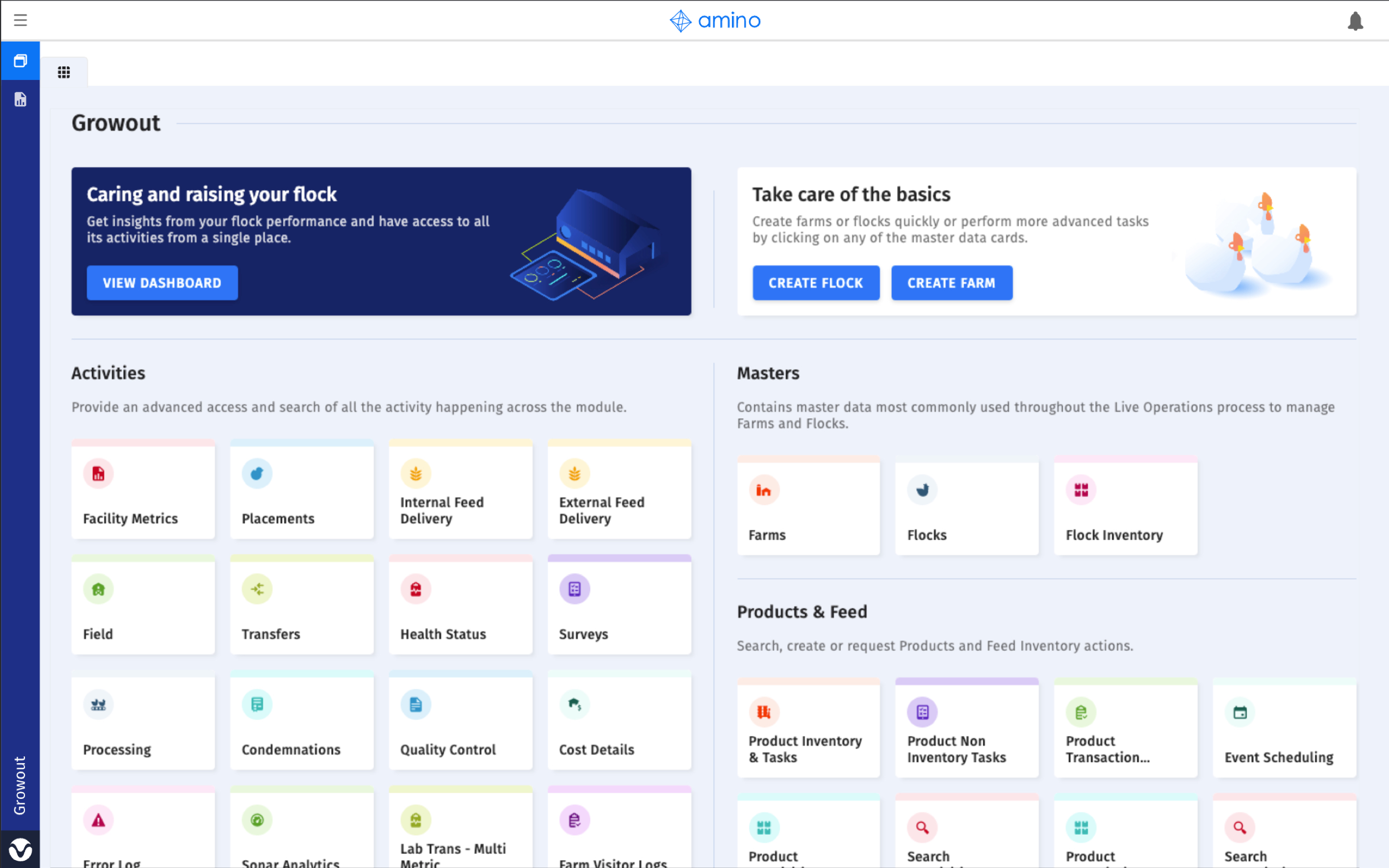
When moving the sidebar to the left, the updates that need to be made are the following:
1. Move the hamburger icon button to the left side.
2. Select the ‘Uncollapse’ option for the visible sidebar, leaving the navigation as icons only. After Hotjar reviews, users do not use the uncollapse option of the sidebar. They may not even be aware of its existence, which is typically included in the onboarding process, but for two options, it may not be necessary.
3. Logo will be moved to the top middle of the page.
4. Move the Settings icon to the inside of the sidebar to treat it as a separate module.
5. Move the log-out option to the inside of the module navigation.
Feedback from Product Owners
- Users move around modules a lot, so it might be better to get the Sonar approach to keep consistency and allow users to move easily through modules.
Answer: There is a tool in the application created specifically for users who move constantly around the app.
- What we choose should be reflected in the other applications to maintain consistency.
Answer: We should replicate the decision across the applications. And it works for the others.
- Why can’t we have more options across the header?
Answer: We can. Currently, we’re considering the notification bell, but we also have the minimize wizard action and the onboarding tool available in the header. It might get too crowded if we keep adding actions.
Based on the comments, this is the second approach:
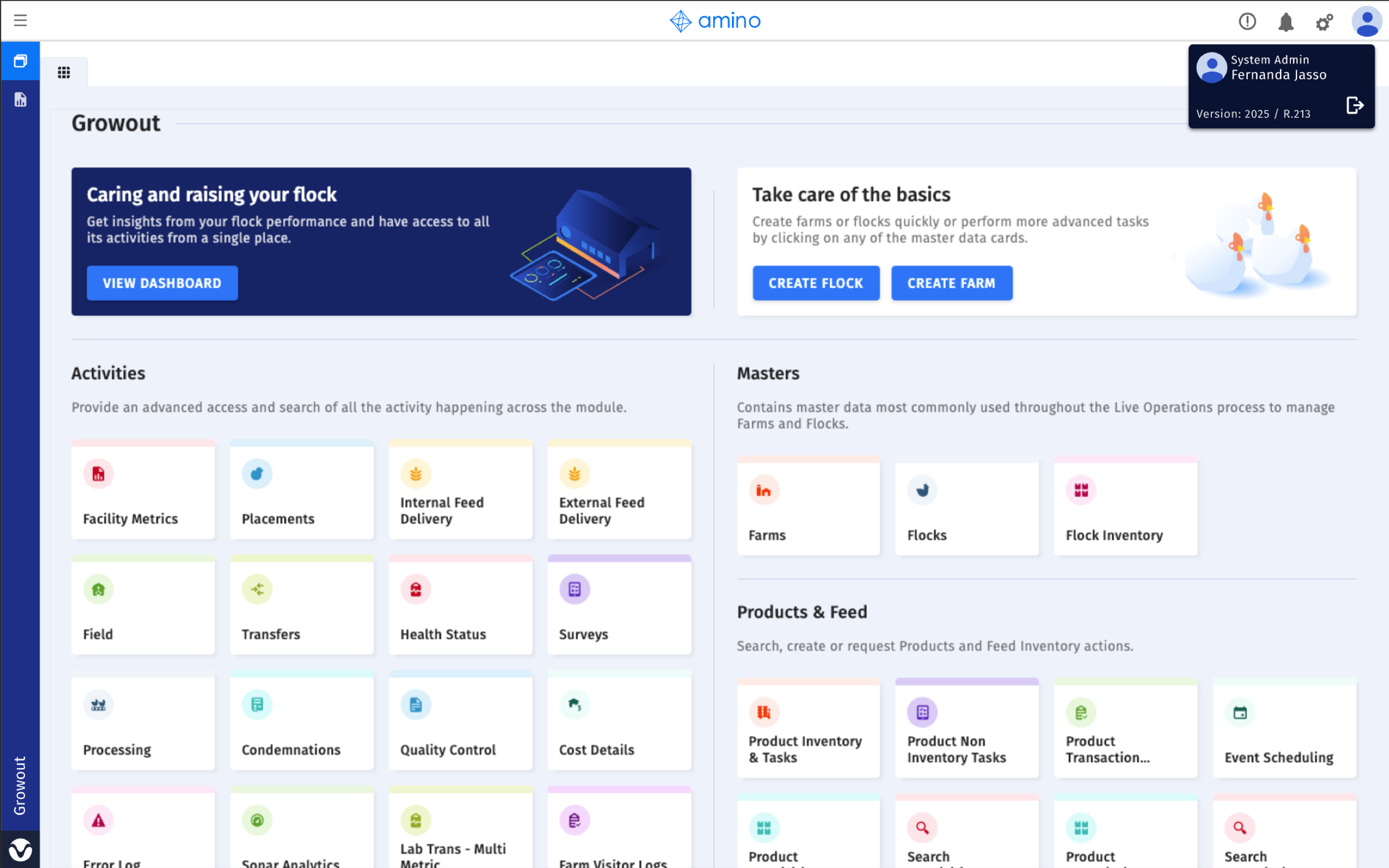
A decision was made to create a poll that would allow users to provide their input. The survey included two GIFs showing the proposed options for the new navigation, along with a third option called “Neither works for me.” As well as a comment box.
Pendo Survey
A survey in Pendo was generated with the two selected flows in GIF mode, allowing users to see the proposed changes.
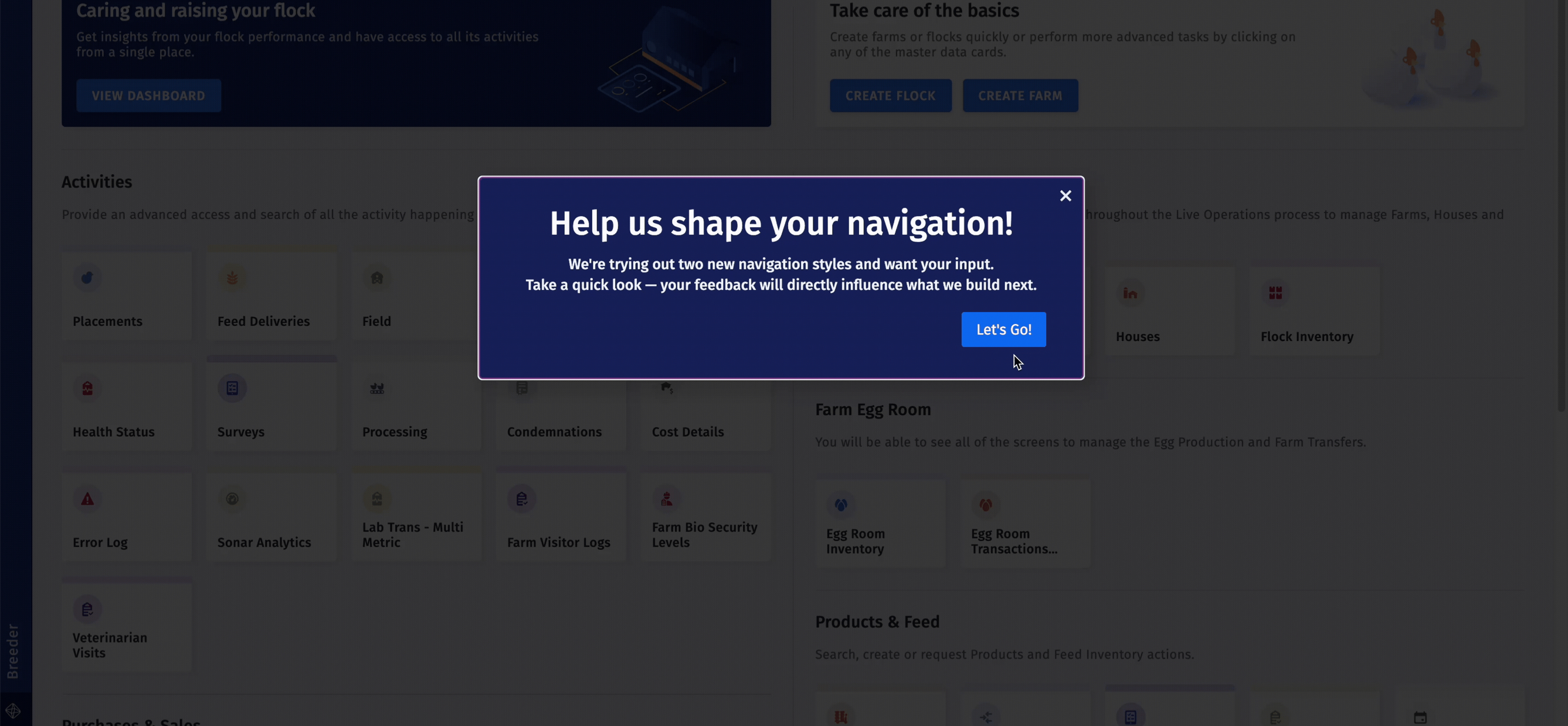
The results of the survey were the following:
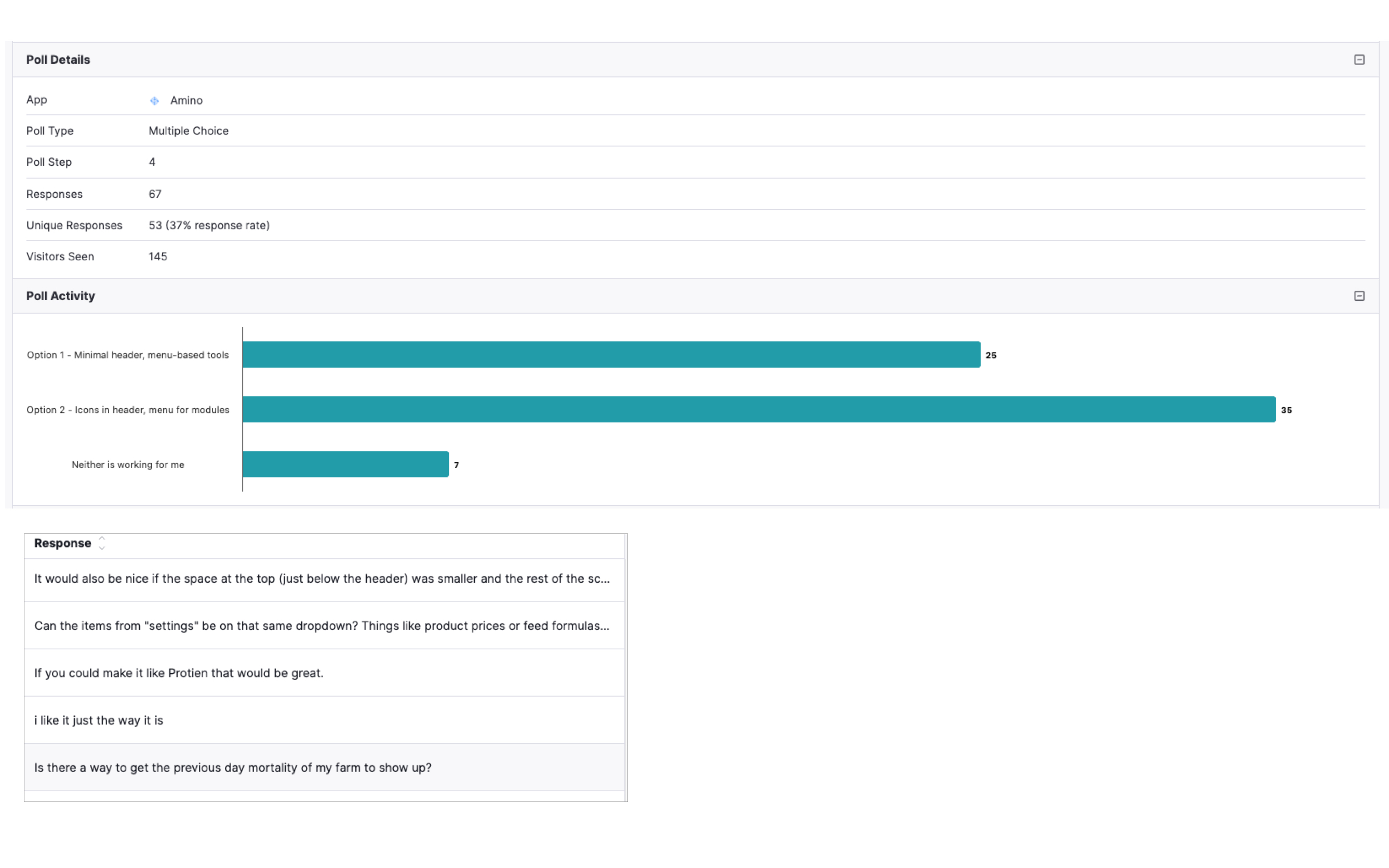
Analysis
The results of the survey inclined towards the second option, which is having easy access to the toolbar at the header.
Even if they got a majority of votes, the first option was a very close call.
Upon analyzing the users who voted for each option, a clear division emerged between those who came from a previous version of the app and those who were new to the application.
Therefore, it was decided to conduct this test using a different approach.
AB Testing.
Which will bring the following:
Cons:
– Longer development times.
– More research before making the decision.
Pros:
– As small as this change may seem, it will impact the way users navigate across the application and other apps within the business.
– It may take users a longer time to get used to this update, so it is a good practice to review how often they’re using the toolbar at the top.
– We can get comments from users who are working their day-to-day with the update, and fix whatever is needed. We may be able to reach a middle ground between the available options.

